Tag Archive for visual comprehension

The Tone and the Interface

2013-03-21 Cheese from Farmers Market Amsterdam

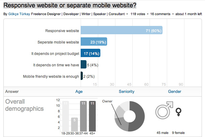
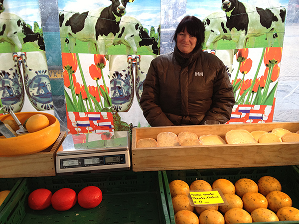
I just returned from a brief visit to The Hague and Amsterdam. When in a foreign country encountering an unfamiliar language, it’s easy to focus on the visual presentation of content since the linguistic portion of the presentation is unavailable for processing. People who can read can’t help but do so when presented with text. But when one can’t process the linguistic content, all that is left are visual clues (and smells and sounds…). So I took a few snapshots to show how the tone of the interface impacts the emotional processing of content and attitude of the customer to the content. Selling Cheese in Amsterdam This is a farmers’ market stall in the middle of Amsterdam, selling home-made cheese. The woman in the photo is the actual cheese maker. Note the hand-lettered signs, the simple wooden boxes, the plain presentation — the overall effect is home made goods, care in production, quality product, even made with love. Fancy production values would just be off putting in this context, and probably result in lower sales of cheese. This NOT a museum, but rather a neighborhood cheese store in Amsterdam. (It is located next door to the flower museum…). What is…

Perceptual Blindness in Design

Toy Packaging and Design Fails

It is not always users that fail to see some particularly “cool” aspect of design, failure to notice which leads to failure in product use. Designers are people too and are just as prone to cultural and perceptual blindness — total inability to notice additional (sexual) meanings hidden in their designs. Below are examples that I’ve been collecting from email forwards over the last few years. The general groups are toy packaging, store signs, logos, religious strangeness (especially with cultural shifts in time), product labels, and in particular strange dentists’ ads… Enjoy! Thank you all who contributed to this post!

Separate Mobile Website Vs. Responsive Website

2012-10-30 LinkedIn Poll on responsive design

Frost, B. (2012). “Separate Mobile Website Vs. Responsive Website.” smashingmagazine.com. Visited on October 25, 2012: http://mobile.smashingmagazine.com/2012/08/22/separate-mobile-responsive-website-presidential-smackdown/ This article is about how to address the challenges of the mobile web by either creating a separate mobile website or creating a website that is responsive to different screen sizes. These two approaches are illustrated by the websites of the 2012 presidential candidates: Mitt Romney’s campaign has created a dedicated mobile website, while Barack Obama’s campaign has created a responsive website. The article looks at two use cases for these sites (someone looking for information and someone looking to take action) and how each of the different mobile approaches addresses them. Conceptual Design The article examines two mobile design approaches using Kristofer Layon’s model, which is based on Maslow’s hierarch of needs pyramid. Primary access and navigation are the most essential aspects of the mobile experience while enhancements like HTML 5 features are the least essential. How each method addresses the two mobile approaches is important for any product designer. Interaction Design Access to website content is the most import function of a mobile site. The Obama site is responsive, so all the content of the full-featured site is available to a mobile…

RE: Is Pink Necessary?

How many different ways can someone describe a color? There is a delightful video titled “Luscious” by the Sappi paper company Off Register. In it, the main character attempts to describe the exact shade of “luscious” she wants printed on paper. “It’s like the inside of a baby polar bear’s ear,” she tells the printer. “It’s a nuclear accident, but there’s no problem with it,” she insists. “It’s like King Kong French kissed you … stop it Kong!” All of the metaphors from “Luscious” have another thing in common: They link disparate ideas, a seductive idea with a dangerous one. This is the problem encountered with Annie Paul’s article “Is Pink Necessary?,” which is a review of the book Cinderella Ate My Daughter by Peggy Orenstein. What color best describes a little girl’s sexuality? But little girls have no sexuality, one may protest. Research indicates they do, that children identify with external signs to determine their sex. What then is the hue of sparkly tulle and chiffon? What is the color of a kiss blown from the palm of your hand or a coyly twirled finger in softly dimpled cheek? From the viewpoint of product design, the article is better contemplated as a…

Design and the Olympic Games

Aerial Shot of the London Olympic Stadium

The Olympic Games are coming to a close and there are some interesting design decisions that seem worth mentioning. But let’s start with a cursory set of design requirements: safety, transportation, visibility and observability of events, entertainment, fairness, cultural sensitivity and appropriateness, and so much more. As with all design problems, divide and concur is a good approach: who are the audiences; what are their needs; what are the time, budget, and personal resources of the project; and what are the considerations (goals) of the sponsoring country. These are the basics of product design. From these variables, we can set priorities and deduce probabilities of errors and failures and how to accommodate them with design. Clearly, this is too much to cover in one blog, but here are a few thoughts… Safety There are many safety concerns in staging big, multinational events. Let’s first consider the different groups of individuals: safety for the participants, organizers, audience, supporting staff. We can break this down even more (by country, by sex, by religion, by location, by celebrity, etc.), but these are the large categories. It’s important to consider the safety for each group separately and provide supports as necessary. There are different…

Where to post the “OK” Button on the Screen?

OK Button on Early Mac

I have very strong opinions about where on the screen the OK or NEXT or SUBMIT buttons go in relation to CANCEL. Without giving it away, I’m going to walk through the design decision tree and provide a lot of references for both sides of the issue — yes, there are strong feelings about the right versus the left position choice. I’m not alone! Passive versus Active Buttons Active Buttons are the ones that advance the action to the next level. Passive ones return the users to previous state, negate the action sequence. OKAY, OK, NEXT, SUBMIT, ACCEPT, GO are all active buttons. CANCEL, BACK, PREVIOUS are action that reverse forward momentum and push the user to places they’ve been before. HELP and INFO sidetrack the user and distract from forward thrust of activity. In general, product designers want to move the users toward their goals — thus we want the perceptual focus to be on the action buttons. We want to make sure that users fist see the way forward, and then click on the right button that propels them forward to completion of the task. All distractions and side movements should be downplayed with Interface Design with the…

30,000 Years of Logo Evolution

Logos have undergone an amazing amount of visual change in the last 30,000 years — obvious statement, isn’t it? But if you look at the change, all grouped together, what we are seeing is the evolution of visual language. The way we relate to icons and what we want them to be is changing continuously. From “I was here” hand print on the wall of an ancient cave to the modern version of Apple logo, we are just trying to make a brand that the current generation of users finds visually appealing.