Tag Archive for iPad

Going Potty…or iPotty!

Edge Designs Men's Restroom Mural

An iPotty App for kids learning to use a toilet: And here’s a bit for an older audience: Would it have worked if the sexes were reveres — images of staring men on the walls of women’s room? I don’t think so… And here’s a link to a previous post on this subject: Toilet Games

Where to post the “OK” Button on the Screen?

OK Button on Early Mac

I have very strong opinions about where on the screen the OK or NEXT or SUBMIT buttons go in relation to CANCEL. Without giving it away, I’m going to walk through the design decision tree and provide a lot of references for both sides of the issue — yes, there are strong feelings about the right versus the left position choice. I’m not alone! Passive versus Active Buttons Active Buttons are the ones that advance the action to the next level. Passive ones return the users to previous state, negate the action sequence. OKAY, OK, NEXT, SUBMIT, ACCEPT, GO are all active buttons. CANCEL, BACK, PREVIOUS are action that reverse forward momentum and push the user to places they’ve been before. HELP and INFO sidetrack the user and distract from forward thrust of activity. In general, product designers want to move the users toward their goals — thus we want the perceptual focus to be on the action buttons. We want to make sure that users fist see the way forward, and then click on the right button that propels them forward to completion of the task. All distractions and side movements should be downplayed with Interface Design with the…

US Rio+2.0 Speed Geeking Session

FrontLine SMS Screen Shot

So I’ve learned a new word: Speed Geeking. It’s like speed dating but for geeks to quickly present their ideas to a small group. You have five minutes strict, and then move on to the next presenting geek. It was a very interesting format, but it clearly had accessibility issue: I walk with a cane and I found it very hard. It would have been impossible in a wheelchair. And others with disabilities clearly had issues with this format. But that said, I’ve learned a lot. Below are my notes on the Speed Geeking event at US Rio +2.0. Noel Dickover — Senior New Media Advisor, Office of eDiplomacy, U.S. Department of State — introduced Speed Geeking and ran the event with an iron fist! FrontlineSMS Demoed by Sean Martin McDonald, Director of Operations http://www.frontlinesms.com Main Point: SMS is cheap data that is easy to structure and moves over cell networks (without Internet) Yahoo Demoed by Gil Yehuda, Director of Open Source Product Management at Yahoo! Gil talk about the use of Flickr for journalism, human rights, and keeping people safe. He raised the issue of copyright. KIVA Demoed by Beth Kuenstler, VP of Marketing & Communications If you haven’t…

Rewired Brain

Our kids have grown up in the world where computers were always present and always on. They can’t conceive of a time when they can be cut off from the Internet (vacations in the Internet-dead zones are definite no go). Our kids are the generation of fully-connected always-on Internet users. What about the kids that are born right now? Not the Millennials, as they are being called, but these babies born in the age of the iPad? The iTouch Babies? How are their brains being rewired from the experience of having the iPad as their first toy? Check out this video of a baby girl growing in the iTouch World.

Thinking About the Future of Reading

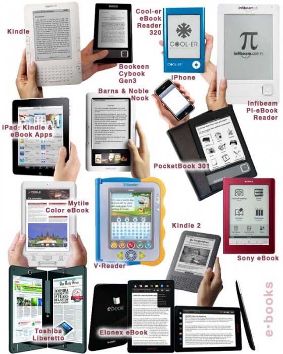
The Taxonomy of Usefulness We are a family with two Kindles, three iPads, two iPods, and an iPhone. We also have a few thousand old-fashioned paper books stored on bookshelves in every nook and cranny of our home: bedrooms, bathrooms, kitchen, stairs, garage, closets, family room, and any other space and surface that might hold a book or two or ten. We are into reading! And we use our Kindles, iPads/Pods/Phone, and computers to read as well. And while statistically speaking, we make just four data points for four family members, I feel we have something interesting to say about using technology to read. To help me understand my own relationship with reading and technology, I’ve come up with a little Taxonomy of Usefulness. If you’ve been reading this blog (or my books and papers), you’d have noticed that I like to slice up the world into groups sorted by a set of variables that I find useful at the time. Forming categories helps me think—the Cognitive Wheel is a prime example. Taxonomy of Usefulness These variables help derive the value of the electronic reading devices. Ergonomics There are many attributes to consider when describing the ergonomics of a device,…

On “For digital artists, apps provide new palette”

Harmanci, R. (2010). “For digital artists, apps provide new palette.”  New York Times Online. Retrieved on October 4, 2010: http://www.nytimes.com/2010/08/20/us/20bciart.html To illustrate the impact of mobile/handheld-device technology on the arts, this article describes the work of several individual artists who have used iPhone/iPad applications as an artistic format. In my overview, I focus on the work by Scott Snibbe and pose the following question: what is it about handheld apps that sets them apart and makes them a more successful environment for interactive art than any other? Scott Snibbe is an artist for whom interactivity, i.e. the opportunity for audience participation, is a central theme. His installations are often designed to capture human bodily actions and respond to them. The audience thus has the experience of bringing an art piece’s content into existence. For example, in Falling Girl (2008) and Make Like a Tree (2006), people’s movements are replicated, with some time lag, by silhouettes projected onto screens, while in Blow-Up (2005) people’s breath triggers fans that reproduce its spatio-temporal contour.  Snibbe’s very popular mobile apps are closely based on an earlier Dynamic Systems interactive series that involved manual action, except that their original version used more traditional cursor-based interface. …

Metacognition Failure: If I find it easy, it must not be important

Making something easy to understand is extremely difficult. A good designer knows this, knows how hard one has to work to make something comprehensible and easy to use. Unfortunately, users and consumers of products (including education) tend not to get it. We live in society ruled by “More is Better” p-prim: more stuff is better, more money is better, more food is good, more medication is great…more, more, more. Movies, television, newspapers, magazines, all reinforce this idea in our minds. We live in a “super-size me” world. But this basic decision-making algorithm leads to very faulty reasoning. There are multiple corollaries to the “more is better” axiom: thick books without graphics are more educationally valuable, more important (this is based on research I did many years ago with 5th graders); longer essays are clearly better and should get higher graders (the students worked harder/longer on them); big words are better than small ones in expressing ideas (thus we get very pretentious writing); work should be judged by the time it took to complete and not by the quality of the results it produces; more expensive clothes (cars, stereos, etc.) are clearly more valuable (this is a true statement, but most…