Tag Archive for design errors

What’s in a Cover?

Coding Peter Suddenly Paris 2 Covers

The design of the cover can make the book… or so I was told. Certainly, bad covers don’t contribute to sales. But good covers are difficult. And the thought on cover design has changed over the years… just like fashion. Since I tend to design my own covers (and I’m an artist and a designer), I wanted to put together some ideas, if not rules, to follow and some background of how to think about book cover design. Because if you don’t do your own, you still need to communicate what you want with the person that does. Book Covers Through Time To appreciate a cover, it helps to understand its roots. I won’t go back far, since my genre is science fiction, just a hundred years or so. Consider the cover evolution of Jules Verne’s “Journey to the Center of the Earth”: There is a movement from frills to realism to a strong graphic look of the more modern editions. While for the 1800’s editions, we might find it difficult to identify the genre of this story, by the time we hit 1960s, there is no doubt that this is a science fiction or fantasy novel. The cover alerts…

Users Making Fun of Interface Icon Designers

laundry icons fails

You know you failed as an icon designer when users exchange humor forwards on Facebook based on your work. We’ve all done it — we’ve all looked at the little labels on our clothing and tried to figure out what those iconic instructions mean. The icons are so bad that manufacturers themselves are making fun of them! There is not a huge downside for in this case failure, though, in this case. At worst, the piece of clothing would be ruined. Painful, but in the scheme of things not that bad. But other circumstances are more troubling. Last night, an alert lit up on my car’s dashboard. It was a strange symbol, a bit rounded, some waves on top. I had no guess as to what it was. It was accompanied with a bright red glowing triangle with an exclamation sign inside — the universal sign for warning, pay attention! Should I pull off the road? Is this bad? It’s dark and raining outside. Thankfully, my car manual was in the glovebox — I could look this up. In took a few minutes but I figured out that the strange symbol means low pressure in one of my tires (no…

Writing for App Development

In the world of business, the writing process is often ignored. Complete thoughts are shortened to bullet points. Proofreading is considered a luxury, resulting in spelling errors or missing words. Content requirements go overlooked. This video for a large healthcare nonprofit started with a great vision and the outline of a several unique stories. The director created story boards with captions describing each scene but since there were no speaking parts in the video, a script was never written. The models in the video were merely supporting characters to the story’s real stars: the mobile apps. We used the app development process as a proxy for the writing process. The “script” was written into wireframes. However, the words that appeared on the mobile devices needed to be written as a separate document. But because a writing process was not followed, copywriting was done directly in the wireframes, resulting in overly complex wireframes in a format that was inaccessible to the producers. Too often, producers are more concerned with headlines and big pictures, not details. But just as in any app development process, each button needs a label, each alert needs a message, each form field needs a caption, each instruction needs…

Some Examples of Design Failure in Physical Space

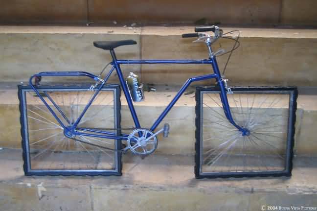
square wheeled bike

Affordance is a feature of an object or an environment that suggests a set of possible actions/interaction that a user of such object/environment can perform with it. For example, if an object has a handle (e.g. tea cup), a user can reasonably expect to pick it up via that handle without spilling the contents of the cup. On the other hand, no one has an expectation of the wheels of the bike below turning… We all recognize the bike above as an art piece. As a connoisseur of design failure, I regularly get emails with collections of failed design objects or situations. When I get enough to share, I usually post them on this blog. Bathrooms design fails seem to be a favorite, but there are others… Enjoy! (or my personal experience in The Hague) Some problems arise when the design specks change over time, like the size of a toilet paper roll versus the toilet paper holder… Some problems arise when the maps are out of date… or Some are due to timing and lack of built-in error handling… But some design solutions are there to fix the problem of cultural differences: