
Below is an example of communication error — Penn and Teller use strong emotional language and delivery to hide the true meaning of the message. In context — a pretty young woman anxiously and passionately asking individuals at a faire to protect the environment — signing the petition makes sense. People sign many petitions. And the more people sign (or the more signatures they see on the petition), the more likely others sign as well. A woman, seemingly in distress over an environmental problem, inspires an emotional reaction — people want to help. We have a built-in social value system that encourages this kind of behavior. And finally there’s a strong p-prim that all chemicals are bad — so just hearing a chemical compound in a petition gets a response from the crowd. The result? On the language comprehension continuum, these faire goers didn’t do so well…
Tag Archive for contextual actions
Conceptual Design, Cultural Differences, Interaction Design, Interface Design, Pipsqueak Articles, Product Design Strategy
Design and the Olympic Games
by Olga Werby •

The Olympic Games are coming to a close and there are some interesting design decisions that seem worth mentioning. But let’s start with a cursory set of design requirements: safety, transportation, visibility and observability of events, entertainment, fairness, cultural sensitivity and appropriateness, and so much more. As with all design problems, divide and concur is a good approach: who are the audiences; what are their needs; what are the time, budget, and personal resources of the project; and what are the considerations (goals) of the sponsoring country. These are the basics of product design. From these variables, we can set priorities and deduce probabilities of errors and failures and how to accommodate them with design. Clearly, this is too much to cover in one blog, but here are a few thoughts… Safety There are many safety concerns in staging big, multinational events. Let’s first consider the different groups of individuals: safety for the participants, organizers, audience, supporting staff. We can break this down even more (by country, by sex, by religion, by location, by celebrity, etc.), but these are the large categories. It’s important to consider the safety for each group separately and provide supports as necessary. There are different…
Conceptual Design, Interaction Design, Pipsqueak Articles, Product Design Strategy, Reference
Special Preview: Socio-Technical System Design
by Olga Werby •
Brian Whitworth and Adnan Ahmad contributed a chapter on Socio-Technical System Design for the free Interaction-Design textbook. This is a very interesting, if technical discussion of the subject. While reading it, I kept thinking about how I would love to debate some of the points raised in this Chapter in person. But lacking this opportunity, below are my ideas and thoughts on the subject of Socio-Technical System Design. First, let me give a quick summary of what is a socio-technological system paraphrasing a bit from Whitworth and Ahmad own words: Socio-technology is about technology and people. Technology is any device. IT system is then a combination of software AND device(s). Human computer interaction (HCI) is a person plus an IT system. Introduction of “person” brings physical, informational and psychological levels into the combined system. And finally, socio-technical system (STS) is merger of community and HCI(s). A Bit of Historical Perspective When my son was in third grade, he was given an assignment: compare some technology from today with that of 100 years ago. He chose transportation. Here’s his insight: 100 years ago, going from San Francisco to Berkeley took a very long time. There were no bridges. People had to drive their…
Conceptual Design, Errors, Featured, Interaction Design, Interface Design, Perception, Perceptual Blindness, Perceptual Focus Errors, Pipsqueak Articles, Product Design Strategy
Where to post the “OK” Button on the Screen?
by Olga Werby •
I have very strong opinions about where on the screen the OK or NEXT or SUBMIT buttons go in relation to CANCEL. Without giving it away, I’m going to walk through the design decision tree and provide a lot of references for both sides of the issue — yes, there are strong feelings about the right versus the left position choice. I’m not alone! Passive versus Active Buttons Active Buttons are the ones that advance the action to the next level. Passive ones return the users to previous state, negate the action sequence. OKAY, OK, NEXT, SUBMIT, ACCEPT, GO are all active buttons. CANCEL, BACK, PREVIOUS are action that reverse forward momentum and push the user to places they’ve been before. HELP and INFO sidetrack the user and distract from forward thrust of activity. In general, product designers want to move the users toward their goals — thus we want the perceptual focus to be on the action buttons. We want to make sure that users fist see the way forward, and then click on the right button that propels them forward to completion of the task. All distractions and side movements should be downplayed with Interface Design with the…
Conceptual Design, Interaction Design, Interface Design, Perception, Pipsqueak Articles, Product Design Strategy, Scaffolding
Alternative Haptic Interface for 3D Animation and Drawing
by Olga Werby •
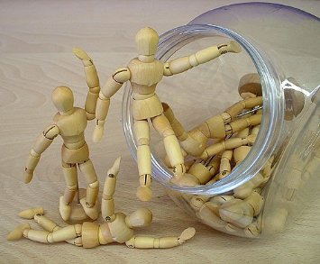
Qumarion built a prototype of a mannequin input device for intuitive 3D manipulation. For many years, artists used little wood manikins to help them with perspective and body positioning. 3D artists also used them for references, but there was no way translate directly from haptic manipulation of a little wooden figure into x, y, and z position in virtual space. Now there is:
Conceptual Design, Diagnostic Errors, Interaction Design, Interface Design, Perception, Pipsqueak Articles, Product Design Strategy, Scaffolding
Design Solution to Real World Problem — Speeding!
by Olga Werby •

Knowing something about behavior, visual processing, and human nature, designers can nudge users into doing the right (or in this case, lawful) action. Speeding is a problem all over the world. People are notorious for underestimating the real amount of time it takes to get places they need to be. Traffic congestion, car problems, detours, and other (un)foreseen events can make a huge difference in time variability of getting from one place to another. The problem, though, is that we can’t really force people to leave on time or drive the speed limit when the drivers think that no one is looking. So with the law on our side, we can create other ways of forcing people to behave lawfully by changing environmental conditions and relying on human nature not to do what’s right, but to do what they think they have to based on circumstance. Here are a few creative ways of solving the speeding problem on our streets. Using Visual Processing Errors to Slow Traffic Canadian drives misdiagnose the problem and try to drive straddling the “hole” in the road. Everyone is successfully slowed down. The Fake Traffic Cop Threat as a Speeding Deterrent In general, people tend…
Conceptual Design, Interaction Design, Interface Design, Perception, Pipsqueak Articles, Product Design Strategy, Scaffolding, Users
Special Preview: Wearable Computing (Steve Mann)
by Olga Werby •
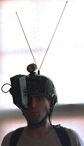
The next chapter in the Interaction-Design.org tome on human-computer interaction design is now up for an early review to my readers. This chapter takes on Wearable Computing and is written by Steve Mann. Mostly, this is a historical review of Prof. Mann’s experimentations with wearable computing devices, and for those unfamiliar with this subject area, this is an interesting introduction. On the left, you can see an early version of wearable computing: Steve Mann’s backpack based system from the late 1970’s and early 1980’s. But as always, I have a slightly different take on this topic… The Little Mac That Saved My Son’s Life Almost 18 years ago, I went into a preterm labor. At 24 and a half weeks into gestation, this was very scary. At the time, San Francisco Children’s Hospital was pioneering a program for high risk pregnancies (which mine just turned out to be). Two doctors, Dr. Kuts and Dr. Maine, figured out how to use an old Mac SE, a modem, a telephone, a subcutaneous pump, and a belt which measures contractions to allow women like me to stay at home as much as we could (as opposed to spending months in the hospital). Here’s…