Tag Archive for branding

Group Color Preferences

Red Head Festival, crowd shot

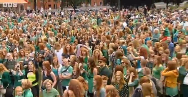
The Color of the Redhead Festival… …is NOT red! An annual festival of redheads has been taking place in Breda, Holland, was held on 3 September of this year. Almost 2000 red heads from 52 countries gathered together to share and revel in their DNA, BBC corresponded Tim Allman reported. In the sea of red, what stands out is a clear preference for color green. Somehow, the color green become the unofficial uniform of the red-headed. It’s not like they all thought: “I think everyone will be wearing green, so should I.” More likely, redheads believe they look better in green. But when every one in the group shows up in green, it strengthen the bond. Red Delegates, Blue Delegates Check out this crowd shot of the republican convention. Notice any color that stands out? How about at the democratic convention? And here’s a lighting scheme for the democratic convention: The convention organizers used color as a reenforcement of political unity for the delegates at both conventions. Using Color to Cement Group Affiliation There are certain professions that signal group membership with color: white used to be the preference for doctors and scientists working at a lab; green or blue…

Interface Design Failure: Man accidentally kills 40,000-sq-ft lawn due to packaging design

What can bad interface design do? Bad graphic? Bad packaging? There are people who think these don’t matter (I had a few clients like that), but here’s an example of how badly things turn out when interface design isn’t taken seriously. And here’s another example from one of my previous posts: eye medicine or super glue? You’d be the judge!

30,000 Years of Logo Evolution

Logos have undergone an amazing amount of visual change in the last 30,000 years — obvious statement, isn’t it? But if you look at the change, all grouped together, what we are seeing is the evolution of visual language. The way we relate to icons and what we want them to be is changing continuously. From “I was here” hand print on the wall of an ancient cave to the modern version of Apple logo, we are just trying to make a brand that the current generation of users finds visually appealing.

Special Preview: Disruptive Innovation

Needs-satisfaction Curve of a technology by D. A. Norman

Interaction-Design.org The folks from Interaction-Design.org have just completed their newest chapter: “Disruptive Innovation” by Clayton M. Christensen. This chapter is an excerpt from Dr. Christensen’s 1997 book “The Innovator’s Dilemma: When New Technologies Cause Great Firms to Fail,” published by Harvard Business Press. His newer book, “The Innovator’s DNA: Mastering the Five Skills of Disruptive Innovators,” published in 2011 on Kindle, is a follow up to the ideas in the first book and those expressed in the Interaction-Design.org chapter. Disruptive Innovation The main idea of this chapter can be summed up by Donald A. Norman’s graph (see below). This is a graph of product performance over time — think of “product” is its most expansive form. When the product is first introduced into the market, it might not be “ready for prime time”, as we say — meaning that the product is: difficult to use, or too expensive, or replacing a well-established way of doing things, or has a high learning curve: even difficult to use products can have a shallow learning curve that allows small accomplishments right away by novice users, or requires a large ecosystem of other products and services that are not widely available: think electric cars…

How Do We Think of Brands

I found this video by Adam Ladd — he made a video of an interview with his 5 year old daughter talking about brands. He showed her some very famous logos, and she told him what she thought they were. Naturally, this is a girl from a middle class background, from America. The answers would be very different from a 5 year old brought up in Russia or Papua New Guinea. Notice how she is able to quickly identify a Nike logo. And Disney’s D. And what’s really amazing is that she knows what a logo is in the first place! This little kid has developed a brand p-prim! And she has a well-developed comprehension of visual symbols. I wonder how the same interview would play out in a different culture…

Intel i5 Core Commercial: When a company just doesn’t get it

Sometimes, a company just doesn’t get it: it’s not about what a product can theoretically do, but what it can do for the user. Intel has a history of making a particular type of commercials — “the power inside” commercials, I call them. Intel marketing people use the following mental model: people/men like muscle cars; people like powerful things; thus if we emphasize the power “on the inside” people would like our computers. And so their current commercials for Intel i5 Core look like this: So what’s wrong with this? It’s all about them, it’s not about me. I don’t care what’s inside the machine, I care what it can do for me. Or, more accurately, what I can do with it. It’s about my performance. Imagine going to a car lot and the car salesmen tells you: “It got huge pistons. I mean HUGE. You’ve got to see those pistons!” Perhaps some car buyers would get inspired by such language, but I bet most would find it puzzling. Why should I care? Does it drive well? What’s the performance like? Maneuverability? Intel’s commercials about its chips are just like a car manufacturer’s fetish remarks about pistons. Sure some would…

Cultural Differences from the 4th Dimension: Time

Some cultural differences are brought to you by geographic distances, but some derive their wonderful exotic qualities from temporal separation. The ads below are all American…just from a different America—America of yesteryore. Role of Women What wives are for? Make her happy this Christmas—make it a hoover! Blow smoke in her face, she’ll love it! Go ahead and cry for it… Housework makes wives cute! Housework makes wives healthy. Healthy Kids Beer for mommies and babies… Give that baby a cola! Give your children the benefit of TV. Healthy You! Give cocaine a chance… Doctors prefer Camels. For a slimmer, flatter, more sinuous you, go with tape worms!