
We just returned from An Event Apart San Francisco and I am trying to put down notes and ideas while they are fresh in my mind. It was three full intense days of information — some great, some good, some not so much. But overall, it was a valuable experience (and they do conference right — great food, comfortable location, endless supply of coffee and sugar). My take is always unique — I overheard some people who were ecstatic over the presentations that I felt were completely off — but I have been in the business for over three decades now and I want ideas that are new to me. So here are my notes from the presentations. “The Fault, Dear Brutus (or: Career Advice From a Cranky Old Man)” by Jeffrey Zeldman A lot of what Jeffery spoke about resonated strongly: the need to force ourselves to get rid of disdain for our clients that just “don’t get it” — mutual respect is the foundation of designer-client relationship in conversation about design, focus on purpose and use and stay away from esthetics — every person has their own sometimes, people (clients, bosses) are incapable of seeing our growth as…
Tag Archive for affordances
Conceptual Design, Interaction Design, Interface Design, Pipsqueak Articles, Product Design Strategy
Fun, Creativity, and Good Design
by Olga Werby •

The best product designs not only work well, they make us smile. They solve problems we as consumers haven’t even consider yet or realized we had. Take a look at a selection of product designs below. The springy bed frame is not only functional, but a conversation starter — don’t you want to try it out? The “selfy stick” helps us take better photos of ourselves. Our arm reach is no longer a limitation or a liability — I like my portraits taken from the top to reduce that double chin! It’s fun to be elegant… until it all crushes down around us. Finger tip tray is the solution! Finger food will stay safely on top of the tray with this cool design. And again, it’s a conversation starter — a perfect tool at a party. While I’m not sure I would advertise my waist size with this imaginative belt, it could serve as a powerful reminder to keep to a diet. Serving tea to your aunt? Wouldn’t this put a smile on her face? In one of my design classes, a student proposed a bed light that would adjust to awaken the sleeper gently. This one does it with…
Anchoring Errors, Background Knowledge, Background Knowledge Errors, Causal Net Problems, Cognitive Blindness, Conceptual Design, Cultural Bias, Cultural Differences, Diagnostic Errors, Errors, Interaction Design, Mental Model Traps, Metaphor Mistakes, Mirroring Errors, Misapplication of Problem Solving Strategies, Perceptual Blindness, Perceptual Focus Errors, Pipsqueak Articles, Reference, Scaffolding
Review eBook: Affordances and Design
by Olga Werby •

Victor Kaptelinin, a Professor at the Department of Information Science and Media Studies, University of Bergen, Norway, and the Department of Informatics, Umeaa University, Sweden, just published an eBook with Interaction Design Foundation: “Affordances and Design.” I was asked to write a review of this book and provide some insights into using affordances in interaction design and HCI. Let me start by providing the definition of affordance as given by Donald Norman: In his eBook, Victor Kaptelinin provides the history of the idea of affordance from its initial introduction by James Gibson in 1977 to the present day. The eBook’s bibliography and reference section is a great place to start the exploration of this topic for anyone new to these ideas. Unfortunately, the book doesn’t help much if an individual is looking for some guidance on how to apply these ideas in practical situations during interaction design or HCI design. For clarity’s sake, allow me to give a very brief explanation of affordances, from their roots to the present time. When James Gibson first introduced the concept of affordances, he focused on physical environment — what actions are possible? And the set of these action were invariable — just because…
Anchoring Errors, Conceptual Design, Interaction Design, Interface Design, Mental Model Traps, Product Design Strategy
When Design and Interface are Dictated by the Technology
by Olga Werby •

You’ve probably heard: If you have a hammer, everything looks like a nail. This is a commentary on how our problem solving perspective is influenced by the tools we happen to have in our hands at that moment. The tools, of course, don’t have to be physical. They can be systems, or lists, or a set of approaches that we’ve learned at school or that are enforced at work. And they can also be digital tools that we feel particularly comfortable using. These “tools” constrict our metal models, limiting the possible solutions to the design problems we face at work (or at home). It’s not a surprise that if we Google “WordPress Templates,” all the results look more or less the same. This is partly because of the tool — WordPress is a great tool, but as any tool, it limits the final creative output to what is easy. (Especially, if the designer is not a programmer.) Here’s a look at Google Image results for “WordPress Screenshots”: What’s interesting is the flip side of this phenomenon. Once we see a lot of nails, we expect nails as the solution. So it is not a surprise that not only do most…
Conceptual Design, Cultural Differences, Interaction Design, Interface Design, Product Design Strategy, Reference, Scaffolding
Design for Social Good
by Olga Werby •
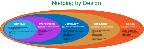
Social engineering is way of designing products and situations which actively encourage people to behave in a desired way — Nudging for Good. EDF Challenge “Sharing energy in the city, 2030” seems an ideal circumstance for social engineering for the greater social good. The basic question is how do we as designers find ways to incentivize individuals to save energy? How do we make a bit of personal sacrifice an attractive option for most? How do we “nudge” people to behave in a socially responsible ways when it comes to energy use? First, it makes sense to break up the problem into several user categories: personal energy sharing, family sharing, neighborhood or community sharing, city or village sharing. At each level we expand the circle to involve more and more individuals, and so we need a different approach for each category. Each category has a set of pressure points on which social engineers can apply pressure to achieve the desired changes. Once we identify the user groups targeted for “nudging”, game theory can be used to find the most attractive options. While there are numerous strategies that can be borrowed from game theory to incentivize the desired energy sharing behavior,…
Featured, Perception, Pipsqueak Articles, Product Design Strategy, Reference
Colorblindness Test on iPhone Google Traffic Map
by Olga Werby •
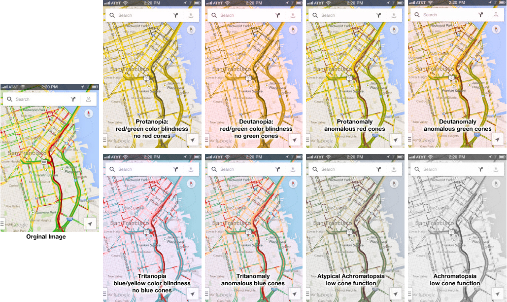
Google Traffic Map on an iPhone (or any other mobile device) is a great product… unless you are colorblind. Then, it’s a nightmare! 5% to 20% of the population has some kind of color processing disorder. Here is a simple test if you are one of those. Which of the following look the same to you? Click on the image above to enlarge. Red/green confusion — Protanopia: red/green color blindness, no red cones; Deutanopia: red/green color blindness, no green cones; Protanomaly: anomalous red cones; Deutanomaly: anomalous green cones — are the most common visual processing problems. But there is also blue blindness — Tritanopia: blue/yellow color blindness, no blue cones; and Tritanomaly: anomalous blue cones. The most rare cases are the monochrome colorblindness, the true loss of color — Achromatopsia: low cone function; and Atypical Achromatopsia: low cone function with some color. As designers, we have to be aware of our audiences’ limitations and strength. And visual processing and comprehension is no exception. In the past, I’ve written about colorblindness: . But unfortunately, the site that helped identify problems with design doesn’t seem to work. Here’s a new sit e for your reference: Colorblind Web Page Filter If you are…
Cultural Differences, Interaction Design, Pipsqueak Articles, Product Design Strategy
Some Examples of Design Failure in Physical Space
by Olga Werby •
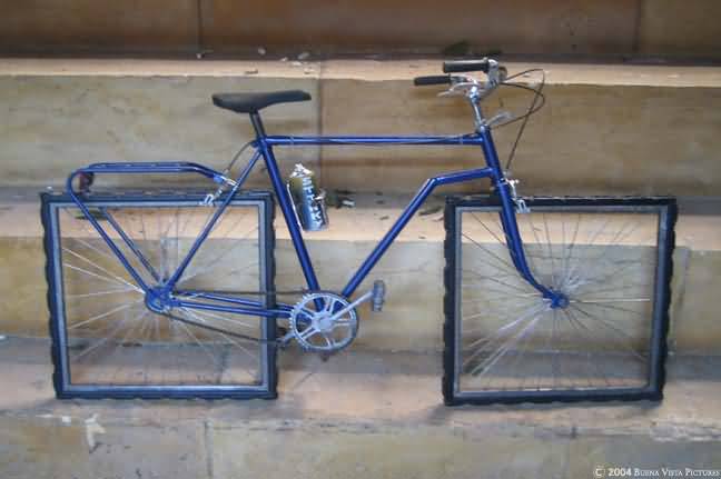
Affordance is a feature of an object or an environment that suggests a set of possible actions/interaction that a user of such object/environment can perform with it. For example, if an object has a handle (e.g. tea cup), a user can reasonably expect to pick it up via that handle without spilling the contents of the cup. On the other hand, no one has an expectation of the wheels of the bike below turning… We all recognize the bike above as an art piece. As a connoisseur of design failure, I regularly get emails with collections of failed design objects or situations. When I get enough to share, I usually post them on this blog. Bathrooms design fails seem to be a favorite, but there are others… Enjoy! (or my personal experience in The Hague) Some problems arise when the design specks change over time, like the size of a toilet paper roll versus the toilet paper holder… Some problems arise when the maps are out of date… or Some are due to timing and lack of built-in error handling… But some design solutions are there to fix the problem of cultural differences: