
Svitil, K., (2008). “Wine Study Shows Price Influences Perception.” California Institute of Technology. Visited on October 4, 2010: http://media.caltech.edu/press_releases/13091 This article is a research study about how the region of the brain called the medial orbitofrontal cortex showed higher activity when participants drank wines at a higher price. A wine tasting study was conducted at the California Institute of Technology and Stanford University. Twenty volunteers tasted five wine samples at different retail prices: $5, $10, $35, $45 and $90 per bottle. The volunteers tasted and evaluated which wines that they found more pleasurable. Two out of five of the wines were the same but one was priced at $10 and one at $90. In the experiment the subjects rated and preferred the $90 priced wine more than the $10, although they did not know that they tasted the same wine. Cognitive Design What does the product do? In this study the cognitive design was a wine tasting experiment. The concept of the research was to experiment on the perception of price on different wines. The setting was controlled in that the subjects did not know that they tasted the same wine but told that the price was different. While tasting…
Perception
Conceptual Design, Contributor, Interaction Design, Interface Design, Perception
Re “Why Good Dancers are Attractive.”
by Arun •
BBC Staff, (2005). “Why good dancers are attractive.” BBC News. Retrieved on 11 October, 2010: http://news.bbc.co.uk/2/hi/health/4550000.stm Summary: A song accompanied by an incredible dance can be an exhilarating experience. We have always loved our dancers who rhythmically move their bodies to music. According to this article we not only love them, but find them attractive too. Our mind is biased to seek partners who have symmetry, and good dancers tend to be symmetrical. So by transitivity and motion-capture cameras researchers from the Rutgers university have established that good dancers are attractive. Charles Darwin suggested that dance was part of courtship ritual in various species. Yet another research by Dr William Brown suggests that women tend to be more selective when choosing a mate as they bear the majority of childcare burden. So they might seeks partners who exhibit better symmetry as it projects a partner who can be confident and assertive. As researchers have established that symmetry is a trait we might passively observe, designers can exploit this trait of ours. Conceptual Design: Given that we find symmetrical people attractive, we can extend this objects to as well. Symmetry is one such quality where we dont want it explicitly, but…
Attention, Attention Controls Errors, Background Knowledge, Perception, Perceptual Blindness, Perceptual Focus Errors, Pipsqueak Articles
Perceptual Illusions
by Olga Werby •
Our minds play tricks on us all the time. Once the information has entered our cognition via our senses, it still has to get processed to be understood. Like any other data, it’s all about context. For interesting examples of optical illusions, please visit http://www.lottolab.org/articles/illusionsoflight.asp. R. Beau Lotto has put together a few interesting examples of mis-processing! Or watch him deliver a talk at TED.
Conceptual Design, Contributor, Interaction Design, Interface Design, Perception
Sense of Touch Shapes Snap Judgments
by patrickgary •
Keim, B., (2010). “Sense of Touch Shapes Snap Judgments.” Wired.com. Visited on October 3, 2010: http://www.wired.com/wiredscience/2010/06/touching-cognition/ Brandon Keim’s article for Wired.com’s science blog provides a brief overview of recent research into the role that tactile sensations play in human interactions. This new area of psychological research, referred to as Embodied Cognition, could potentially have a significant impact on how we understand social and physical interactions. Put simply, the core findings of the research show that our physical responses to our immediate environment, combined with other factors, can directly and measurably influence our decision-making. One of the examples provided involved giving the subject a heavy clipboard to hold during the experiment; when holding the heavy clipboard, the subjects tended to regard their own opinions and problems presented to them as being more weighty and serious in nature. Other examples showed how a tactile interaction with a rough surface prior to an interview could lead to a harsher attitude towards the interviewee. The article itself is somewhat of a stub, so we are left to imagine the further implications of Embodied Cognition ourselves. What relevance does Embodied Cognition have for product interaction design? After all, it’s not as if touch has previously…
Errors, Ethnographic & User Data, Interface Design, Perception, Pipsqueak Articles, Product Design Strategy, Scaffolding, Users
Accidentally Supergluing an Eye Shut
by Olga Werby •

I hope the mere reading of the title made you queasy—it makes me shudder every time. On October 6th, CNN posted a story about a woman from Phoenix, Arizona, who accidentally put drops of super glue into her eye instead of the eye medication. She called 911, and in the emergency room the doctors had to cut open her eye and peel the hardened layer of super glue from her eye ball. If this doesn’t make you sick, then… One may ask: how stupid does one have to be to glue their eye shut? But, as with many other product-use errors, the woman made a very common mistake. The hospital wasn’t surprised—apparently these accidents happen all the time. Because of poor vision, she couldn’t distinguish between the bottles of her eye medicine and the package of super glue. Take a look at this: If you are relying purely on feel, the woman’s error no longer feels so outlandish. Here’s what she probably could see with her poor vision: And here is what we, the well-sighted, could see: So upon a close examination, the woman’s error is a natural mistake. (Yeah, I know, I know: Why would she keep the bottle…
Cognitive Blindness, Errors, Featured, Interface Design, Perception, Pipsqueak Articles
Color Blind Design
by Olga Werby •
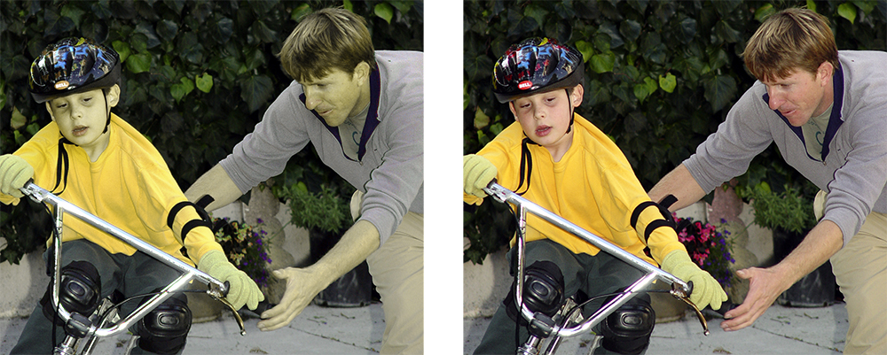
Do you see any difference between these two images? About 10% of the male population (with up to 20% among some ethnic groups) do not. Do differences in the way individuals perceive and process color information matter? Sometimes… Consider this informational graphic: It’s easy to see how the information contained within this chart has been transformed and no longer carries the same meaning. Which is the right one? When designing information for communication, it’s important to consider the totality of the intended audience: What are their strength? What are their limitations? Like cognitive traits, perceptual differences have to be accommodated by good design. Some issues that individuals with deuteranope deficit (red/green confusion) face is inability to tell the difference between colored items that are too thin (lines), point sources, and blinking lights (think traffic lights blinking green or yellow). These problems effect real-life performance and can lead to accidents: think traffic light color confusion. It is the job of a product designer to reduce the difficulties these individuals face. You can use this URL to check your site for color blind usability: http://www.vischeck.com/vischeck/vischeckURL.php
Attention, Background Knowledge, Conceptual Design, Contributor, Cultural Bias, Interaction Design, Interface Design, Perception, Product Design Strategy
On “Legendary Magazine Covers Get Their Own Spread”
by AnneMalhotra •
CNN staff. (2008). “Legendary magazine covers get their own spread.” CNN. Retrieved on April 27, 2008. http://edition.cnn.com/2008/SHOWBIZ/books/04/25/esquire.coverart.ap/index.html CNN publishes a eulogy of George Lois as his work for the Esquire magazine is going to be exhibited at New York’s Museum of Modern Art. Reviewing some of the magazine covers, the journalist highlights what made the designer’s shots iconic. In this respect, two main arguments come up. First, the journalist lays an emphasis on the power of the images. Describing Muhammad Ali posing as Saint Sebastian, he shows to what degree it stroke people’s memory. In fact, in Lois’ point of view, the photograph has to make a powerful statement to push the viewer to look at the article inside. Not only did he succeed in doing that but he also stroke people’s memory to such an extent that they still remember where they first saw this cover at the time. His photographs gave polemical statements on political, cultural but also social issues and triggered heavy debate in the society. They became iconic through their simplicity of evocation and their ability to instill a tinge of provocation about contemporary issues. The Vietnam covers are telltale when it comes to affecting the…