Interface Design

What does the product feel and look like?

When Design and Interface are Dictated by the Technology

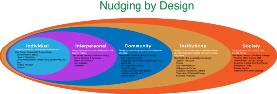
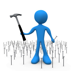
You’ve probably heard: If you have a hammer, everything looks like a nail. This is a commentary on how our problem solving perspective is influenced by the tools we happen to have in our hands at that moment. The tools, of course, don’t have to be physical. They can be systems, or lists, or a set of approaches that we’ve learned at school or that are enforced at work. And they can also be digital tools that we feel particularly comfortable using. These “tools” constrict our metal models, limiting the possible solutions to the design problems we face at work (or at home). It’s not a surprise that if we Google “WordPress Templates,” all the results look more or less the same. This is partly because of the tool — WordPress is a great tool, but as any tool, it limits the final creative output to what is easy. (Especially, if the designer is not a programmer.) Here’s a look at Google Image results for “WordPress Screenshots”: What’s interesting is the flip side of this phenomenon. Once we see a lot of nails, we expect nails as the solution. So it is not a surprise that not only do most…

Design for Social Good

Social engineering is way of designing products and situations which actively encourage people to behave in a desired way — Nudging for Good. EDF Challenge “Sharing energy in the city, 2030” seems an ideal circumstance for social engineering for the greater social good. The basic question is how do we as designers find ways to incentivize individuals to save energy? How do we make a bit of personal sacrifice an attractive option for most? How do we “nudge” people to behave in a socially responsible ways when it comes to energy use? First, it makes sense to break up the problem into several user categories: personal energy sharing, family sharing, neighborhood or community sharing, city or village sharing. At each level we expand the circle to involve more and more individuals, and so we need a different approach for each category. Each category has a set of pressure points on which social engineers can apply pressure to achieve the desired changes. Once we identify the user groups targeted for “nudging”, game theory can be used to find the most attractive options. While there are numerous strategies that can be borrowed from game theory to incentivize the desired energy sharing behavior,…

Fashion and Interface Design

Fashion Design shows have started up again: Fall 2014. I confess to a guilty pleasure of paging through photo after photo of the latest styles. There is something like a cross between artistic exuberance and freak show, all rolled into one insane media blitz. How can one not look? But there’s more to my looking than pure perverse curiosity. It’s true, I don’t really care what men will be instructed to wear and to like in the next season (or women, for that matter). But I do look for trends and patterns. And I also find something akin to Interface Design sensibility in the fashion industry — which way are we heading? What will be the next thing? What are these designers trying to say with their work? Product Design and Fashion Conceptual Design: What is it? What does this piece of clothing design to do? Keep the person warm? Cool? Modest? Allow them to get a job? Which job? Convey their personality? Cover up scars? Reveal tattoos? Make a political statement? Be cheap? Show off wealth? Last a long time? Be practical? Protect from the elements? Arm against hostiles? Depending on the purpose, clothing can take very different forms.…

The Post-Password Era Begins

In November of 2012, Wired Magazine wrote a cover story titled, “Kill the Password,” in which Mat Honan retold how hackers stole his identity and hijacked his social media accounts. After some research, Honan shared just how easy it is for hackers to steal passwords, often with some fairly low-tech methods. Fast forward to October 9, 2013, when Adobe Systems emailed its users that hackers had stolen encrypted user passwords. However, the fact that Adobe was hacked wasn’t the problem. The email was sent to call attention to the real problem: “We recommend that you also change your password on any website where you use the same user ID or password.” Yikes! How many web-based accounts do I have that use the same user name? In January of 2012, I began documenting all the web-based accounts I use. 66 of 167 web accounts use the same user name. 40 use another. How many use the same password? Coincidentally, 66 use the same password. Despite how obviously vulnerable I am, I might have been complacent enough to ignore my own security negligence had two more Internet companies not emailed me about Adobe’s password breach. On November 16, Eventbrite emailed me to recommend that I change my password on their site because…

Writing for App Development

In the world of business, the writing process is often ignored. Complete thoughts are shortened to bullet points. Proofreading is considered a luxury, resulting in spelling errors or missing words. Content requirements go overlooked. This video for a large healthcare nonprofit started with a great vision and the outline of a several unique stories. The director created story boards with captions describing each scene but since there were no speaking parts in the video, a script was never written. The models in the video were merely supporting characters to the story’s real stars: the mobile apps. We used the app development process as a proxy for the writing process. The “script” was written into wireframes. However, the words that appeared on the mobile devices needed to be written as a separate document. But because a writing process was not followed, copywriting was done directly in the wireframes, resulting in overly complex wireframes in a format that was inaccessible to the producers. Too often, producers are more concerned with headlines and big pictures, not details. But just as in any app development process, each button needs a label, each alert needs a message, each form field needs a caption, each instruction needs…

World-wide Map of Health-based Human Rights Judgments

Benjamin Mason Meier, Assistant Professor of Global Health Policy, is one of the creators of the Global Health and Human Rights Database. Benjamin and his colleagues wanted to collect information on different forms of legal tools used around the world to advance the human rights in health. Here is a link to his paper describing the project: “Bridging international law and rights-based litigation: Mapping health-related rights through the development of the Global Health and Human Rights Database.” I was interested in seeing his data on the map. So I used an open source project CartoDB to plot Benjamin’s data on the map. And here’s a quick visualization. Now I’m interested in comparing the resulting map with The World Bank eAtlas of Global Development maps. In particular, it would be interesting to compare GDP with focus on health-based human rights.

The Tone and the Interface

2013-03-21 Cheese from Farmers Market Amsterdam

I just returned from a brief visit to The Hague and Amsterdam. When in a foreign country encountering an unfamiliar language, it’s easy to focus on the visual presentation of content since the linguistic portion of the presentation is unavailable for processing. People who can read can’t help but do so when presented with text. But when one can’t process the linguistic content, all that is left are visual clues (and smells and sounds…). So I took a few snapshots to show how the tone of the interface impacts the emotional processing of content and attitude of the customer to the content. Selling Cheese in Amsterdam This is a farmers’ market stall in the middle of Amsterdam, selling home-made cheese. The woman in the photo is the actual cheese maker. Note the hand-lettered signs, the simple wooden boxes, the plain presentation — the overall effect is home made goods, care in production, quality product, even made with love. Fancy production values would just be off putting in this context, and probably result in lower sales of cheese. This NOT a museum, but rather a neighborhood cheese store in Amsterdam. (It is located next door to the flower museum…). What is…