
I just returned from a brief visit to The Hague and Amsterdam. When in a foreign country encountering an unfamiliar language, it’s easy to focus on the visual presentation of content since the linguistic portion of the presentation is unavailable for processing. People who can read can’t help but do so when presented with text. But when one can’t process the linguistic content, all that is left are visual clues (and smells and sounds…). So I took a few snapshots to show how the tone of the interface impacts the emotional processing of content and attitude of the customer to the content.
Selling Cheese in Amsterdam
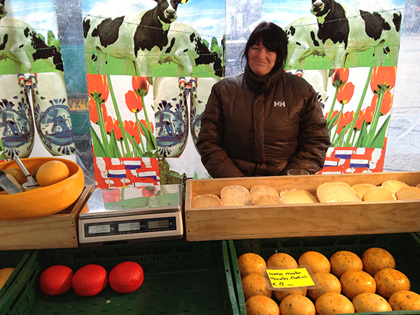
This is a farmers’ market stall in the middle of Amsterdam, selling home-made cheese. The woman in the photo is the actual cheese maker. Note the hand-lettered signs, the simple wooden boxes, the plain presentation — the overall effect is home made goods, care in production, quality product, even made with love. Fancy production values would just be off putting in this context, and probably result in lower sales of cheese.
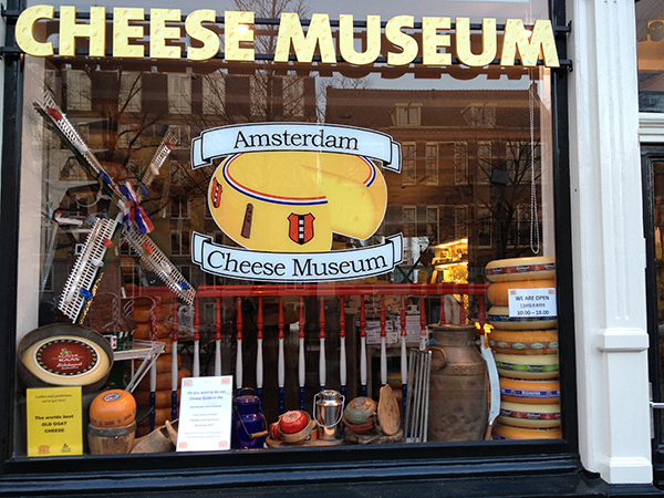
This NOT a museum, but rather a neighborhood cheese store in Amsterdam. (It is located next door to the flower museum…). What is the name — since it is in English, it affects our perception of tone — and the presentation say about this store? Do we think home made? Do we think funny? Would we pay more for the cheese from this store as opposed to the farmers’ market cheese? The interface has a strong impact on what we will be willing to pay and sets our exceptions to quality and price. Note that all of the lettering is printed and uniform, but there’s a strong tongue-and-cheeck component to the presentation.
Selling Shoes
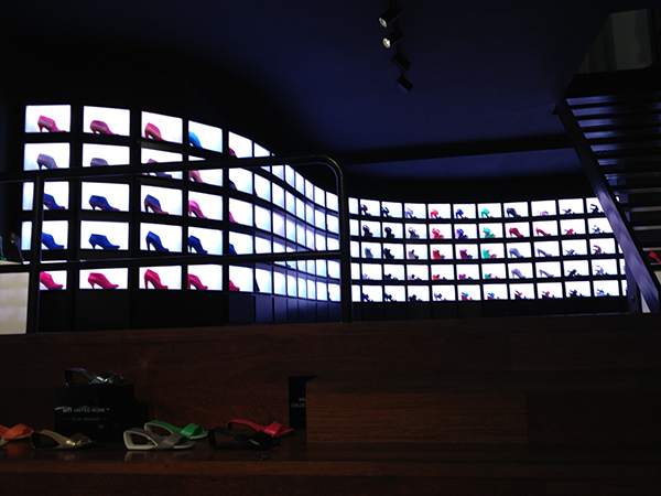
Would you expect to pay a lot for these shoes? If so, why? As you probably guessed, this is a VERY expensive store…
Selling Fish and Other Strange Artifacts
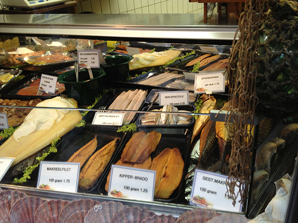
This is a fish store in a small alley in Amsterdam, just off the farmers’ market. Do you think the quality of their product is high? Why? Think about the attention to detail: the little bits of lettuce leaves are green and not a bit wilted — a clear indication of freshness (a halo effect for fish); the decorations are authentic (real shells and artifacts) — the owner is trying to give a sense of place, a connection to the sea; care is given to way each piece of fish is presented, including slices of some of the filets placed on top to display quality and color.
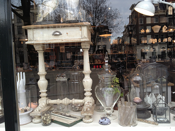
What is this store selling? Food? Clothing? Gifts? How did you guess? What tone does the window try to project? What expectations are set for the type of goods found and sold by this establishment? How quickly did you know?
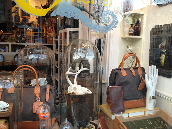
And what about this store? Are the goods different from the one shown above? More or less expensive?
The projected tone via an interface is a powerful tool: it can set user expectations; project business goals of the owner; trigger a “hunt for treasure” instinct; and set apart one product from another.