I have very strong opinions about where on the screen the OK or NEXT or SUBMIT buttons go in relation to CANCEL. Without giving it away, I’m going to walk through the design decision tree and provide a lot of references for both sides of the issue — yes, there are strong feelings about the right versus the left position choice. I’m not alone!
Passive versus Active Buttons
Active Buttons are the ones that advance the action to the next level. Passive ones return the users to previous state, negate the action sequence. OKAY, OK, NEXT, SUBMIT, ACCEPT, GO are all active buttons. CANCEL, BACK, PREVIOUS are action that reverse forward momentum and push the user to places they’ve been before. HELP and INFO sidetrack the user and distract from forward thrust of activity.
In general, product designers want to move the users toward their goals — thus we want the perceptual focus to be on the action buttons. We want to make sure that users fist see the way forward, and then click on the right button that propels them forward to completion of the task. All distractions and side movements should be downplayed with Interface Design with the use of color, placement, size, and other emphasis.
So what is the optimal layout on a page for active and passive buttons?
Paper-based Communication
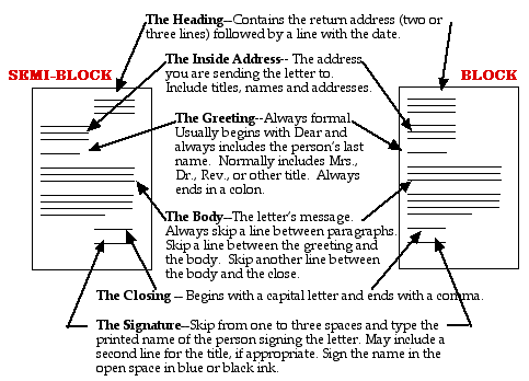
We’ve all been taught the proper layout for a business letter:
Semi-Block format is what most of us are used to. And this format places the signature on the bottom right of the page.
Singnature line on the bottom right works well since the majority of people are right-handed and this placement allows the person to see what they are signing.
HCI History
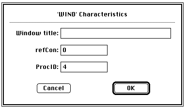
Here’s a bit of history. When Apple first came out with the graphical user interface, all of the active buttons were on the bottom right: explain the action, then make it so.
As you can see, the OK button is prominently outlined and on the right. Cancel button is less noticeable and on the left.
The idea is to keep action moving forward and place action buttons on the bottom right — a natural ending point to a page of text (as in reading).
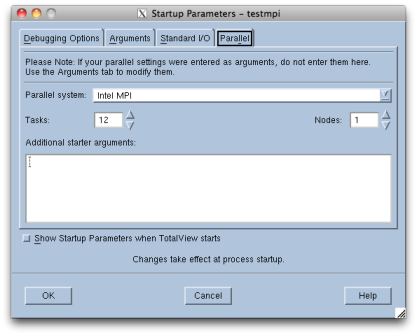
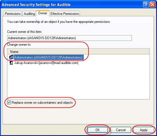
When Windows came out with an “almost identical” interface solutions to HCI, Apple sued. Windows moved its action buttons to left:
Because the buttons are not differentiated visually, it’s easy to see how users can make mistakes.
Windows API still requires action buttons to be placed on the left: Windows User Experience Interaction Guidelines
Some Thoughts and Conclusions
But now, the world has shifted to mobile computing devices (iPhones and smart phones, iPads and tablets, Kindles and e-readers) and on-location computing devices (ATMs and point of purchase devices, airport check-ins, self-checkouts at supermarkets and other shops and gas pumps). So where are the OK and CANCEL buttons on these devices? The short answer: All over the place! And as a consequence, users make millions of errors per day (I’ve personally pressed the wrong button on the self-checkout today).
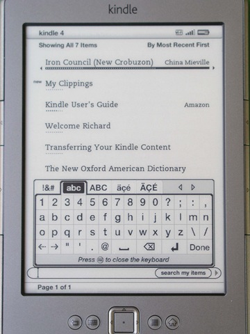
On Kindle, action button, DONE, is on the bottom right.
And “hackers” have voiced their opinions:
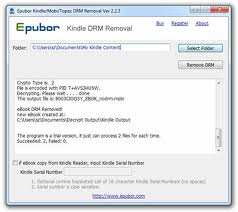
The action button is on the right, at the end of the question: reading from left to right…
Systematicity is the name of the game for HCI. So why can’t we just agree on the best placement of action buttons? I think that part of this is still the historic fight between the Apple and Microsoft GUIs. But as the world moves forward and we become more and more thumbnidexterous, action buttons will have to be placed on the right.
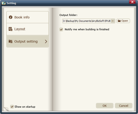
Here’s a few examples on how NOT to design action buttons:

And here’s how I would do it:
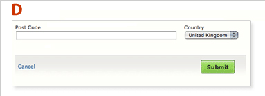
- graphical weight difference between passive and active buttons
- color emphasis on the action button
- placement of the action button on the right and at the end of action sequence
- locate the action button close to the end of action sequence — group action button and action sequence
Background Research
James Kalbach and Tim Bosenick (2003). “Web Page Layout: A Comparison Between Left- and Right-justified Site Navigation Menus.” http://www.dcs.bbk.ac.uk/lo/fi/learningresources/session6/pdp/webnavigationarticle.pdf
Abstract: “The usability of two Web page layouts was directly compared: one with the main site navigation menu on the left of the page, and one with the main site navigation menu on the right. Sixty-four participants were divided equally into two groups and assigned to either the left- or the right-hand navigation test condition. Using a stopwatch, the time to complete each of five tasks was measured. The hypothesis that the left-hand navigation would perform significantly faster than the right-hand navigation was not supported. Instead, there was no significant difference in completion times between the two test conditions. This research questions the current leading Web design thought that the main navigation menu should be left justified.”
Michael Campbell. “The Ultimate Heatmap! How to Triple Your Advertising Revenues Without Additional Traffic.” http://dynamicmedia.s3.amazonaws.com/pdf/Ultimate-Heatmap.pdf
Brief Quotes: “I overlaid hundreds of heatmaps, clickmaps, web usability studies, eye tracking reports and ad placement guidelines from the big ad networks. I then created 30 templates based on this data, and tracked the amount of ad revenue generated, depending on ad position. The result of this research, is a definitive set of nine templates. You can double or triple your ad revenues, without any additional traffic, clicks, or page views, just by moving the ads to the hot spots. A highly fascinating and profitable experiment to say the least.”
Paul Olyslager. “Call To Action Buttons and the Psychology of Color.” http://www.paulolyslager.com/call-to-action-buttons-psychology-color/
Description: “By combining scientific studies on color with some design principles, you can create a great call-to-action button for your website and improve its conversion rate drastically. A CTA-button has 4 important tools to achieve this: placement, shape (and size), message and color. In this article I will talk about the aspect of color.”
Janet M. Six (2010). “Label Alignment in Long Forms | Paper Prototyping for Engineers.” http://www.uxmatters.com/mt/archives/2010/01/label-alignment-in-long-forms-paper-prototyping-for-engineers.php
Luke Wroblewski (2007). “Primary & Secondary Actions in Web Forms.” http://www.lukew.com/ff/entry.asp?571
Description: Luke did a great job of putting together a set of heatmap illustrations with different page layouts. Unfortunately, he didn’t test the one layout that I’m advocating — option D! He also made his layout too long, thus separating the action from its context, thus invalidating the results.
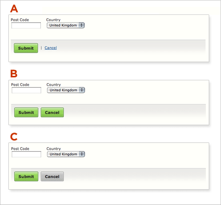
What I’m advocating is layout A with SUBMIT and CANCEL buttons switched in position but with similar interface treatments. See option D above.
Tom Tullis (2008). “OK and Cancel Buttons: What’s the Right Order?” http://measuringuserexperience.com/SubmitCancel/index.htm
Great little research project and here’s Tom’s conclusions: “Avoid using grouped buttons labelled as “OK” and “Cancel” on the web. There’s too great a chance that your users may have a different expectation from yours about which button is which. If they’re in a hurry, they might accidentally choose the wrong button. It’s probably better to use buttons that are visually separated (although perhaps not to the extreme as the ones in this survey). With the buttons visually separated, putting the action to continue (e.g., OK, Save, Submit, etc) on the right is more likely to match your users’ expectations.” Tom agrees with me!
Michael Bernard (2001). “Developing Schemas for the Location of Common Web Objects.” http://surl.org/usabilitynews/31/web_object.asp
Summary: “This study sought to better understand users’ schemas concerning the location of common web objects on a typical website by examining novice (less than one year of web experience) and experienced (three or more years of web experience) users. The web objects examined were: 1) grouping of links that internally connect web pages within the same site, 2) grouping of links to web pages that are external to a website, 3) “back to homepage” link, 4) internal search engine, and 5) advertisement banner(s).”

